Design as Resistance (Part II) – The Evolving Landscape of Activist Design
As editorial design evolves, so too does the landscape of activism. In an era defined by immediacy, information overload, and an ever-scrolling digital feed, the role of the editorial designer is more critical—and more challenging—than ever. The fundamental question remains: how can design cut through the noise and deliver meaning, urgency, and impact?
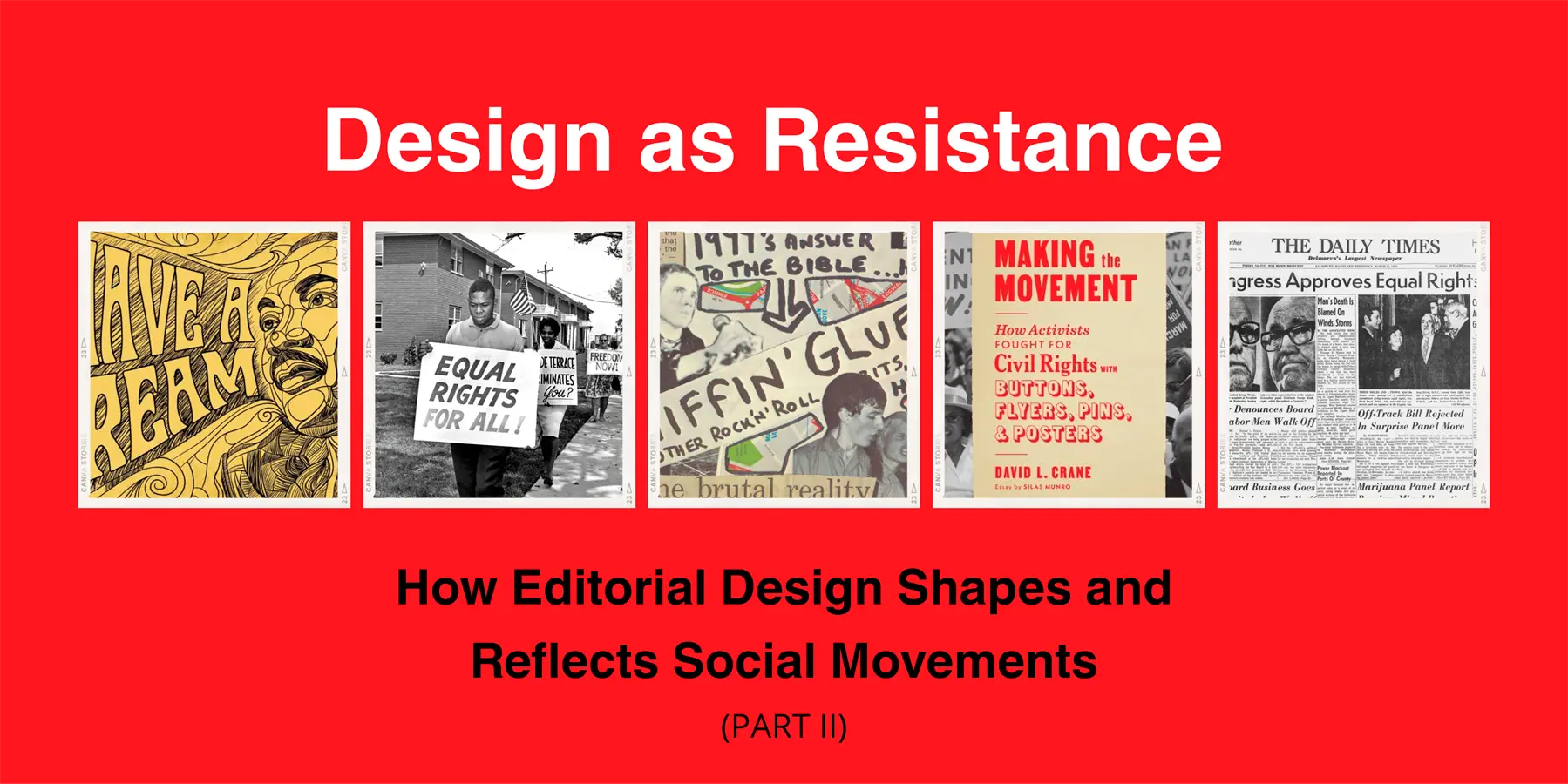
In Part I, we looked at the roots of activist design in the civil rights era and its radical reimagining during the punk and zine movements. Now, we turn our focus to the present and future—where editorial design exists not only on pages and posters but on screens, in algorithms, and within global networks of resistance.
Designing for Virality and Visibility
Modern social movements like #BlackLivesMatter, #TimesUp, and Fridays for Future are global, decentralized, and inherently visual. Platforms like Instagram, TikTok, and Twitter serve as primary stages for activism. Designers working in these spaces face a new kind of brief: create content that’s visually striking, contextually clear, and shareable within seconds.
Editorial design has adapted to these platforms by embracing concise messaging, bold colors, and scroll-friendly formats. The Instagram carousel, for example, has become the modern-day pamphlet. Designers now craft multi-slide posts that break down dense information into digestible, visual storytelling. Key elements like sans-serif typefaces, generous spacing, high-contrast palettes, and illustrative icons all contribute to readability and engagement.
One standout example is the design work of creative collectives like Design to Divest or Decolonize This Place, which blend strong graphic identities with educational content. These posts often use modular layouts—think slide-by-slide infographics—that can be consumed quickly, screenshotted, or reposted with ease, helping messages go viral while retaining nuance.
Print Isn’t Dead—It’s Evolving
While digital platforms dominate, print remains a powerful medium in activist design. There’s been a resurgence of interest in physical formats—zines, risograph prints, protest posters, and broadsheets—especially in local organizing. Print offers a tactile, intimate experience that digital cannot replicate, and its physicality can be a form of resistance against the ephemerality of online discourse.
Publications like The Nib or The Black Women Radicals Reader use editorial design to blend long-form storytelling with striking visuals. These formats allow for deeper dives into social issues—decolonization, gender justice, labor rights—while offering a carefully designed space that invites sustained attention.
Moreover, projects like Press Press or OOMK (One of My Kind) magazine create community-centered print platforms for marginalized voices. Their editorial design choices—handmade typography, collage-style layouts, collaborative illustrations—embody their mission: decentralize knowledge production and reclaim narrative authority.
Typography as a Political Act
Typography—often seen as a background choice—is deeply political in activist design. Typeface selection can express tone, context, and cultural alignment. For example, bold grotesque fonts might suggest urgency and power, while serif fonts can imply historical depth or scholarly credibility.
Some designers even create custom typefaces inspired by resistance. Consider Tré Seals’ Vocal Type Co., which produces fonts based on historical civil rights documents and protest posters. Each typeface has a story, tying the visual language of today’s activists directly to the legacy of those who came before.
This kind of editorial decision turns typography from an aesthetic consideration into a tool of remembrance and continuity—linking current movements to a long lineage of struggle.
Collaborative and Decolonized Design Practices
Today’s most impactful activist design often emerges from collectives rather than individuals. These collaborations involve not just designers, but writers, photographers, organizers, and community members. The editorial process becomes a shared act of meaning-making rather than a top-down presentation of information.
Moreover, there’s a growing emphasis on decolonizing design—challenging Eurocentric aesthetics, questioning traditional hierarchies of knowledge, and embracing pluralistic ways of seeing and expressing. Editorial design in this context becomes a site of cultural reclamation and narrative justice.
Publications like BRICKS Magazine or Mushpit exemplify this intersection of aesthetics and politics. Their bold, sometimes chaotic layouts subvert expectations and celebrate hybridity, while still offering coherent, sharp editorial content that critiques systems of power.
Toward a Future of Intentional Design
As we look to the future, editorial design in activism must remain adaptive yet grounded. Whether it’s through experimental layouts, archival revivals, or new media explorations, design must continue to ask: Who is this for? Whose voice does it uplift? What systems does it challenge?
The next generation of activist designers will likely work across disciplines and mediums—code, print, video, AR, physical space. But their mission remains the same as those who designed handbills in the ‘60s or zines in the ‘80s: to amplify the message, empower the people, and design a better world into existence.
Design is never neutral; it becomes a site of power, protest, and possibility. And as long as there are stories to be told and systems to be challenged, editorial design will remain a vital, dynamic force in the collective struggle for change.