Iconic Editorial Design Publications and Their Influence (PART I)
The Blueprint of Belief – How Iconic Magazines Designed the Reader’s Journey
We’ve all felt it: the magnetic pull of a striking magazine cover, the intuitive ease of navigating a complex article, the sheer satisfaction derived from a beautifully composed page. At TiP (Text in Process), we firmly believe that outstanding editorial design transcends mere aesthetics. It is a meticulously crafted language, a powerful communication tool that shapes perception, guides understanding, and transforms simple text and images into an engaging, coherent narrative experience.
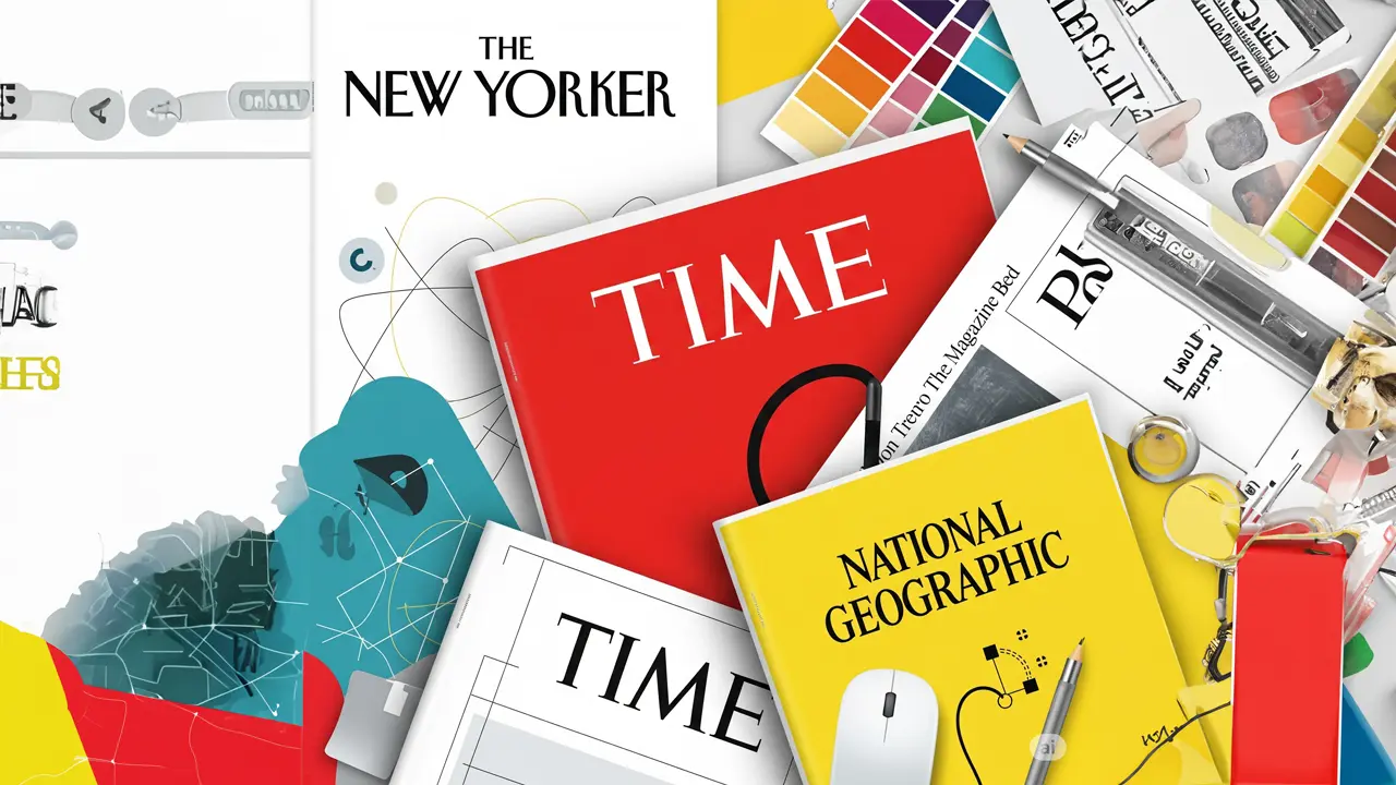
But how do the masters achieve this seamless blend of form and function? In this first part of our two-part series, we embark on a journey to explore the design DNA of some of the editorial world’s most influential titans: The New Yorker, TIME Magazine, and National Geographic. We’ll dissect their distinct design philosophies, examine how they’ve not only cemented their iconic brand identities but also profoundly influenced the landscape of desktop publishing (DTP). Join us as we uncover how these publications have artfully used design to build trust, convey authority, and create an unforgettable reader’s journey.
What is Editorial Design? Laying the Foundation
Before we delve into our case studies, let’s briefly define our terms. Editorial design is the art and practice of laying out and styling content for publications – primarily magazines, newspapers, journals, and books, but its principles extend to any multi-page document, digital or print. Its primary goals are:
- Effective Communication: Ensuring the message is conveyed clearly and efficiently.
- Enhanced Readability & Legibility: Making text easy and comfortable to read.
- Visual Appeal & Engagement: Capturing and holding the reader’s attention.
- Navigation & Structure: Guiding the reader logically through the content.
- Brand Consistency: Reinforcing the publication’s unique identity and voice.
A skilled editorial designer acts as an architect of information, using a palette of visual tools to construct an experience that is both informative and enjoyable.
Case Study 1: The New Yorker – The Enduring Elegance of Literary Design
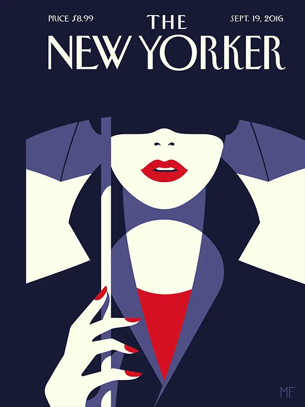 When you pick up The New Yorker, you’re immediately met with a sense of sophisticated restraint and literary gravitas. Its design philosophy is one of understated elegance and unwavering consistency, creating an environment perfectly suited for deep reading and intellectual engagement.
- Typography as Identity: The iconic, custom-designed Irvin typeface for its nameplate and the elegant Adobe Caslon Pro for its body copy are instantly recognizable. The typography isn’t just for reading; it is The New Yorker. The generous leading (line spacing) and comfortable point size prioritize readability for its long-form journalism and fiction. This careful attention to typographic detail establishes a consistent, authoritative voice.
- Layout & Pacing for Immersion: Characteristically, The New Yorker employs a predominantly single-column layout for its main articles. This creates an uninterrupted, immersive reading experience, minimizing distractions. This deliberate pacing, coupled with ample white space (or “negative space”), allows the content to breathe, lending an air of intellectual seriousness and allowing readers to comfortably engage with lengthy pieces.
- Illustrative Covers & Punctuation by Cartoons: While the interior is typographically driven, its covers are renowned for their artistic, often satirical, illustrations that offer commentary rather than literal depiction. These covers have become cultural artifacts in their own right. Internally, the strategic placement of its famous single-panel cartoons provides visual punctuation, moments of levity, and intellectual counterpoints within dense text.
- Subtlety in Color & Contrast: Inside, the magazine relies heavily on the classic, high-contrast pairing of black text on off-white paper, optimizing for legibility. Color is used sparingly, primarily in illustrations, advertisements, and, of course, the cover, making its appearance all the more impactful and deliberate.
Design Legacy: The New Yorker teaches us the profound power of consistent typographic branding and the immense value of designing for sustained reader engagement. Its clear, yet subtle, hierarchy – achieved through nuanced variations in type size and weight for headlines, subheadings, and pull quotes – guides the reader without ever feeling obtrusive.
Case Study 2: TIME Magazine – The Architecture of Authority and Immediacy
 For decades, TIME Magazine has been synonymous with weekly news, delivering information with a palpable sense of urgency and authority. Its design philosophy is meticulously engineered for impact, clarity, and rapid scannability, catering to a reader seeking to quickly understand the world’s most pressing issues.
- The Iconic Red Border as a Frame of Importance: Perhaps one of the most recognizable branding elements in publishing history, TIME’s red border instantly signals its identity and acts as a powerful framing device for its compelling cover imagery. This simple yet bold element screams “important” before a single word is read.
- Cover Impact Through Visual Hierarchy: TIME covers are masterclasses in establishing immediate visual hierarchy. Typically featuring a striking portrait of a newsmaker or a potent symbolic image, the cover subject dominates. This is supported by bold, concise headlines that telegraph the issue’s core theme with urgency. The strategic use of scale here is paramount, ensuring the main message is grasped instantaneously.
- Structured Interior for Digestibility: Inside, TIME employs a more complex grid system than The New Yorker. Multiple columns, sidebars, fact boxes, captions, and infographics break down multifaceted information into digestible, modular chunks. This design allows readers to quickly scan for points of interest or delve deeper into specific stories as their interest dictates.
- Color & Contrast for Emphasis and Navigation: While the signature red of its brand is a key accent, TIME utilizes color and contrast effectively within articles to highlight key statistics, impactful quotes, or to differentiate sections visually. Photography is given prominence, often with detailed captions playing a crucial role in contextualizing images and adding another layer of information.
- Placement for Intuitive Navigation: The placement of elements like folios (page numbers and issue dates), section headers, and visual cues for continuing articles (“continued on page X”) is meticulously planned to aid reader navigation through a diverse and often dense array of content.
Design Legacy: TIME demonstrates how a robust, predictable structure and strong visual hierarchy can make complex information immediately accessible. Its design ensures that even a casual skimmer can grasp the main points, while still providing sufficient depth and detail for more engaged readers, embodying journalistic authority.
Case Study 3: National Geographic – Immersive Storytelling Through Visual Splendor
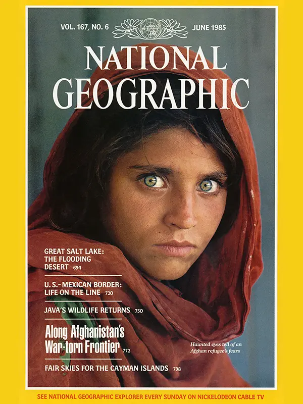 National Geographic has a unique contract with its readers: to transport them to the far corners of the world, to educate, and to inspire awe through unparalleled photography and in-depth reporting. Its design philosophy is entirely centered on creating an immersive, educational, and visually breathtaking experience.
- The Yellow Border & Photographic Dominance: Like TIME’s red, National Geographic’s yellow border is an indelible mark of its brand. It frames a window into another world, with photography as the undisputed hero. Full-bleed images, stunning double-page spreads, and meticulously curated photo essays are its hallmarks. The sheer size, quality, and emotional impact of these images immediately communicate their central importance to the narrative.
- Seamless Integration of Text and Visuals: In National Geographic, text and visuals are not separate entities but partners in storytelling. Layouts are carefully constructed so that articles and their accompanying images, maps, and infographics feel like a single, cohesive unit. Captions are often detailed and rich with information, becoming mini-stories in themselves, extending the narrative power of the visuals.
- Sophisticated Infographics & Cartography as Art Forms: Nat Geo excels in the art of data visualization. Complex scientific, historical, and geographical information is transformed into clear, engaging, and often beautiful infographics and meticulously detailed maps. Here, color is used with precision, not just for aesthetic appeal but for coding information, indicating relationships, and enhancing understanding. Contrast between elements within an infographic is critical for readability and comprehension of dense data.
- Typographic Clarity in Support of Visuals: While visuals undeniably lead, typography is chosen for its utmost clarity and readability. Often, a robust serif typeface is used for body text to support longer narratives, complemented by a clean sans-serif for supplementary information, captions, and data points, ensuring that the detailed textual stories are as accessible as the stunning imagery.
Design Legacy: National Geographic showcases the unparalleled power of visual storytelling. It underscores how the strategic placement of images relative to text, the intelligent use of color to enhance data and evoke mood, and the maintenance of high contrast for readability in complex layouts can create an unforgettable, immersive, and deeply educational reader journey.
Paving the Path: The Unseen Structure
These three giants, each with its unique voice and visual strategy, illuminate a core truth: effective editorial design is about creating a clear, intuitive path for the reader. It’s about understanding the content’s purpose, the audience’s needs, and then applying design principles to meet those needs in a way that feels effortless and engaging.
In Part 2 of this series, we will shift our focus from these specific publications to a more granular exploration of the fundamental design elements—size, color, contrast, placement, typography, white space, and grid systems. We’ll dissect how these tools are used by designers at TiP and across the industry to craft compelling and effective visual communication. Stay tuned!