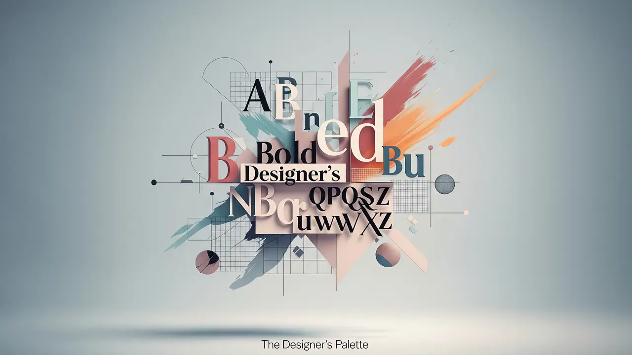
The Designer’s Palette – Mastering the Elements of Editorial Impact
Welcome back to the TiP (Text in Process) blog! In Part 1 of this series, “The Blueprint of Belief,” we journeyed through the hallowed halls of iconic publications like The New Yorker, TIME Magazine, and National Geographic. We explored their distinct design philosophies and saw how they masterfully built reader trust and guided understanding through intentional design choices.
Now, in Part 2, we shift our lens from the “who” to the “how.” It’s time to open the designer’s toolkit and examine the fundamental elements that, when wielded with skill and insight, transform a simple page into a powerful communication device. Understanding these principles—size, color, contrast, placement, typography, white space, and grid systems—is crucial not just for designers, but for anyone looking to communicate more effectively through published materials. Let’s delve into how these elements work in synergy to create clarity, engagement, and lasting impact.
Size & Scale: Dictating Importance and Directing the Eye
The relative size of elements on a page is perhaps the most immediate visual cue for importance. Our eyes are naturally drawn to larger items first.
- Establishing Visual Hierarchy: Designers use a deliberate scale of sizes for headlines, subheadings, body text, images, and captions to create a clear visual hierarchy. A prominent headline shouts “read me first!” while a smaller caption offers supporting detail. This hierarchy guides the reader’s eye in a predictable sequence, ensuring they process information in the intended order.
- Creating Emphasis & Drama: Beyond text, the scale of an image can dramatically alter its impact. A full-bleed photograph commands attention and creates an immersive experience, while a smaller inset image might provide a subtle visual accent. Even a call-to-action button can be made more prominent simply by increasing its size relative to surrounding elements.
- Proportional Relationships: Good design often considers the proportional relationship between elements. Principles like the Golden Ratio or using a modular scale can help create harmonious and aesthetically pleasing compositions where sizes feel ‘right’ together.
Color: Evoking Emotion, Ensuring Clarity, and Defining Brand
Color is a potent tool in the designer’s arsenal, capable of evoking emotion, conveying meaning, enhancing readability, and reinforcing brand identity.
- Psychological Impact & Branding: Colors carry inherent associations and can evoke specific emotional responses (e.g., blue for trust, red for urgency, green for nature/calm). Consistent use of a brand’s color palette (like TIME’s red or Nat Geo’s yellow) builds recognition and reinforces identity.
- Navigation & Organization: Color can be used to code information, differentiate sections within a document, or highlight interactive elements in digital publications. This helps readers navigate complex content more intuitively.
- Readability & Accessibility: The choice of text color against its background color is critical for readability. High contrast is generally preferred for body copy. Designers must also consider color blindness, ensuring that color is not the only means of conveying important information.
- Technical Considerations: In desktop publishing for print, understanding CMYK (Cyan, Magenta, Yellow, Key/Black) color models is essential for accurate reproduction, as opposed to the RGB (Red, Green, Blue) model used for screens.
Contrast: Creating Distinction and Visual Interest
Contrast refers to the juxtaposition of differing elements. It’s what makes elements stand out from each other, preventing visual monotony and aiding comprehension.
- Beyond Color: While color contrast (e.g., dark text on a light background) is vital, contrast can also be achieved through:
- Size: A large headline next to small body text.
- Shape: Organic, curved shapes against geometric, angular ones.
- Texture: A rough texture against a smooth one.
- Typographic Weight: Bold text against light text.
- Creating Focal Points: High contrast in a specific area can create a focal point, drawing the reader’s eye to the most important information.
- Improving Legibility & Reducing Fatigue: Sufficient contrast between text and background is paramount for comfortable reading, reducing eye strain, especially for lengthy content.
Placement & Proximity: Orchestrating Flow and Relationships
Where elements are positioned on a page—and how close they are to each other—profoundly affects how the reader interprets information and navigates the content.
- Guiding the Eye: Readers in Western cultures typically scan pages in a Z-pattern or F-pattern. Designers use this knowledge to place key information along these natural eye paths.
- The Power of Proximity: Grouping related items closely together (e.g., an image and its caption, a headline and its introductory paragraph) visually signals that they belong together. This is a core principle of Gestalt psychology.
- Grids as a Foundation: Underlying grid systems (which we’ll discuss more next) provide a framework for consistent and intentional placement, ensuring balance and order.
- Focal Points & Balance: Strategic placement can create focal points and achieve visual balance (symmetrical or asymmetrical), leading to a more engaging and aesthetically pleasing composition.
Typography: The Voice of the Written Word
Typography is much more than just choosing a font; it’s about shaping the reader’s experience of the text itself. It gives voice, tone, and personality to the words.
- Choosing Typefaces:
- Serif fonts (like Times New Roman, Garamond) have small strokes at the ends of characters and are often considered traditional and excellent for readability in long blocks of body text.
- Sans-serif fonts (like Arial, Helvetica, Futura) lack these strokes and often feel more modern, clean, and are great for headlines, captions, and digital displays.
- Display & Script fonts offer unique personalities and are best used sparingly for emphasis, like in titles or logos.
- Creating Hierarchy: Beyond just size, typographic hierarchy is built using variations in font weight (bold, light), style (italic), case (uppercase, lowercase), leading (line spacing), tracking (letter spacing), and kerning (space between specific pairs of letters).
- Readability vs. Legibility: Legibility refers to how easily individual characters can be distinguished. Readability is about how easily blocks of text can be consumed. Both are crucial. Factors like line length, alignment, and justification also play significant roles.
White Space (Negative Space): The Active Element of Clarity
Often misunderstood as “empty” space, white space is a critical and active component in design. It’s the space around and between elements—text, images, and graphics.
- Improving Readability & Comprehension: Generous white space around blocks of text and between paragraphs prevents pages from feeling cluttered and overwhelming, making content easier to read and digest.
- Creating Emphasis & Sophistication: By isolating an element with white space, designers can give it greater prominence and a sense of importance. High-end brands often use ample white space to convey sophistication and luxury.
- Guiding the Eye & Grouping Elements: White space helps define the boundaries of different content areas and can guide the reader’s eye by creating clear pathways and visual resting points.
Grid Systems: The Unseen Architecture of Cohesion
A grid is an underlying framework of intersecting horizontal and vertical lines (or margins and columns) used to structure content on a page. It’s the invisible skeleton that brings order and consistency to a layout.
- Types of Grids:
- Manuscript Grid: The simplest, a single block for text.
- Column Grid: Divides the page into vertical columns (e.g., newspapers, TIME).
- Modular Grid: Divides the page into columns and rows, creating modules for flexible placement of text and images (e.g., complex magazine layouts, websites).
- Hierarchical Grid: Based on the prominence of elements rather than regular intervals.
- Benefits of Using Grids:
- Consistency: Ensures a unified look across multiple pages and publications.
- Efficiency: Speeds up the design process by providing a pre-defined structure.
- Clarity & Order: Helps organize content logically, making it easier for readers to follow.
- Collaboration: Provides a common framework for teams of designers and content creators.
- Flexibility: While providing structure, a well-designed grid still allows for creative variation.
Bringing It All Together: The TiP Approach
The enduring impact of the iconic publications we studied in Part 1, and the power of the design elements we’ve dissected here in Part 2, all point to a singular truth: thoughtful design is effective communication.
At TiP (Text in Process), we don’t just arrange text and images on a page. We strategically employ every element of the designer’s palette—from the grand scale of a layout to the subtle nuances of typography—to ensure your message is not only seen but understood, felt, and remembered. Whether it’s a comprehensive annual report, an engaging marketing brochure, a clear technical manual, or an elegant invitation, our approach is rooted in these timeless principles of editorial design. We believe that good design makes information accessible, credible, and compelling.
Understanding these elements empowers you to better appreciate the design you see around you and to articulate your own design needs more clearly. When you partner with TiP, you’re collaborating with experts who speak this language fluently, dedicated to transforming your content into a polished, professional, and purposeful publication.
Ready to harness the power of professional editorial design for your next project? Contact TiP today!