Multilingual Typography: Prioritizing Legibility and Language Support
In an increasingly globalized world, effective communication across multiple languages is essential. Whether designing books, magazines, websites, or corporate materials, multilingual typography plays a crucial role in ensuring readability, accessibility, and cultural sensitivity. At Text in Process (TiP), we understand the importance of typography that seamlessly adapts to diverse linguistic needs without compromising design integrity.
Understanding Multilingual Typography
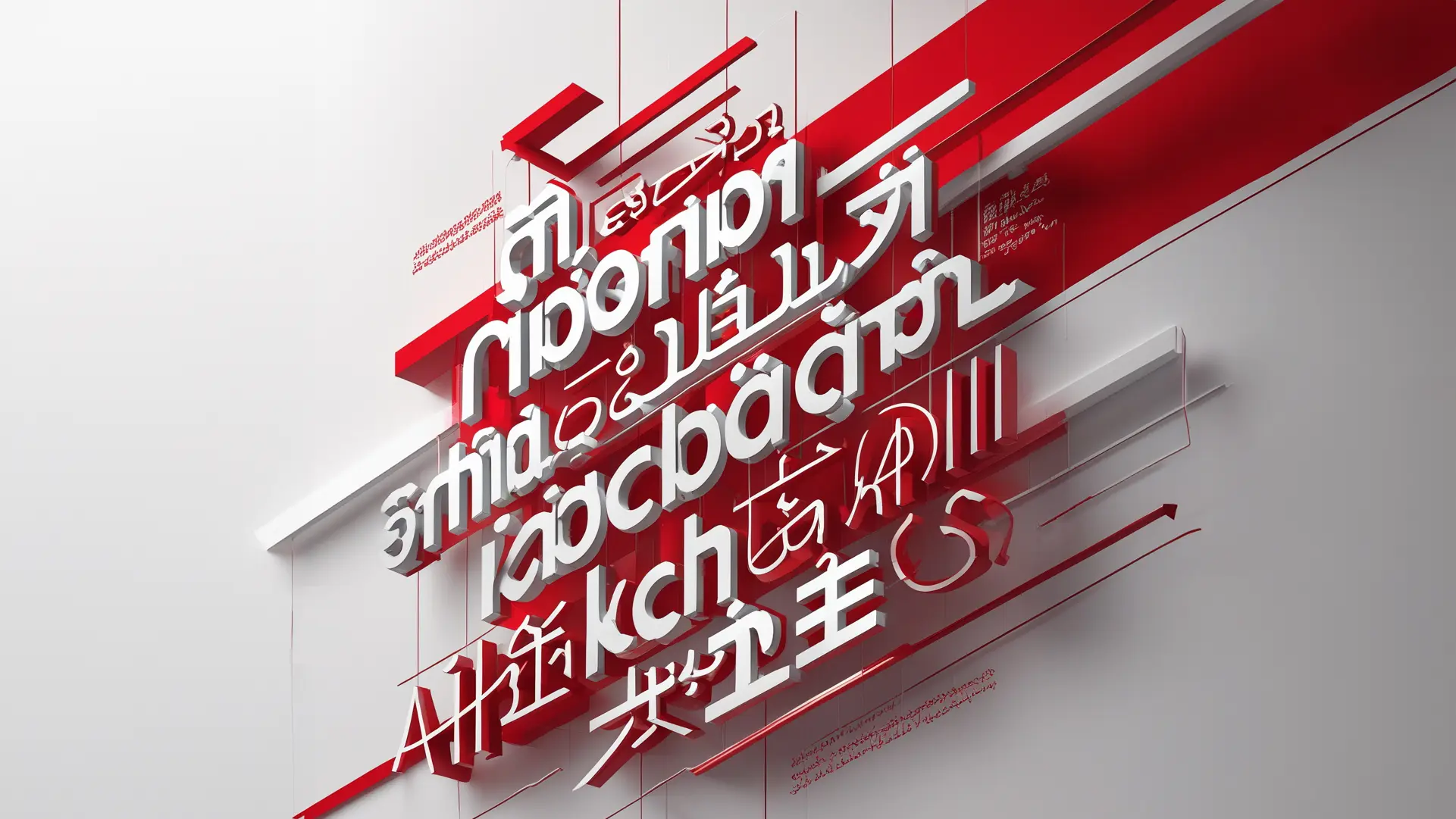
Multilingual typography refers to the practice of selecting and designing typefaces that support multiple languages while maintaining consistent aesthetics and readability. Unlike monolingual typography, which focuses on a single script, multilingual typography must accommodate different character sets, writing systems, and typographic conventions.
Key considerations include:
- Script Compatibility: Different languages use distinct scripts, such as Latin, Cyrillic, Arabic, Devanagari, or Chinese characters. A well-designed multilingual typeface ensures that all supported scripts maintain a uniform visual harmony.
- Character Set and Glyph Support: Some languages require extensive character sets, including diacritics, ligatures, and special symbols. A typeface must provide comprehensive glyph coverage to support accurate rendering.
- Directional Considerations: While Latin-based languages read left to right, others like Arabic and Hebrew are right to left. Some languages, such as Mongolian, are written vertically. A robust multilingual typeface should cater to these variations.
- Typographic Nuances: Kerning, line height, spacing, and stroke contrast vary between scripts. What works well in one language may not be suitable for another. Designers must fine-tune these elements to ensure legibility.
Prioritizing Legibility in Multilingual Design
Legibility is the cornerstone of effective multilingual typography. To optimize readability across languages, consider the following:
1. Choose the Right Typeface: Opt for typefaces specifically designed for multilingual support. Open-source fonts like Noto Sans and Noto Serif from Google are excellent choices because they cover a vast array of languages while maintaining visual consistency.
2. Mind the X-Height and Stroke Contrast: A balanced x-height (the height of lowercase letters relative to uppercase ones) ensures readability, especially in small text sizes. Stroke contrast should be carefully adjusted to avoid excessive thinness or heaviness, which can impact clarity.
3. Ensure Proper Line Spacing and Letter Spacing: Each script has unique spacing requirements. For example, Arabic script needs generous letter spacing to prevent overlapping, while Japanese characters benefit from well-proportioned line spacing to accommodate complex kanji.
4. Account for Diacritics and Special Characters: Diacritics, such as accents and tonal marks, are essential in many languages, including Vietnamese, French, and Polish. Proper positioning and spacing are necessary to maintain legibility.
5. Test Across Different Mediums: A typeface that looks great in print may not perform well on digital screens. Testing across various devices and resolutions ensures optimal legibility across all formats.
Balancing Aesthetics with Functionality
While legibility is paramount, aesthetics should not be neglected. A well-designed multilingual layout maintains a cohesive look while respecting the uniqueness of each script. Consider the following:
- Typographic Hierarchy: Use size, weight, and color to distinguish headings, subheadings, and body text without overwhelming the reader.
- Consistent Styling: Maintaining visual consistency across languages ensures a polished, professional design. However, some scripts may require slight adjustments in size or spacing to achieve balance.
- Cultural Sensitivity: Typography can carry cultural connotations. Choosing a typeface that aligns with the target audience’s visual expectations enhances engagement and comprehension.
The Future of Multilingual Typography
As digital content continues to grow, demand for high-quality multilingual typography will only increase. Advancements in variable fonts and AI-assisted type design are paving the way for even more adaptable and responsive multilingual typefaces.
At Text in Process (TiP), we believe that typography is more than just aesthetics—it’s a bridge between cultures and languages. By prioritizing legibility and language support, we help brands and publishers create inclusive, accessible, and visually compelling content that resonates with diverse audiences.
Looking to enhance your multilingual designs? Contact TiP for expert DTP and editorial design solutions tailored to your needs!
