Shaping the Page: How Visionary Designers Defined Editorial Design
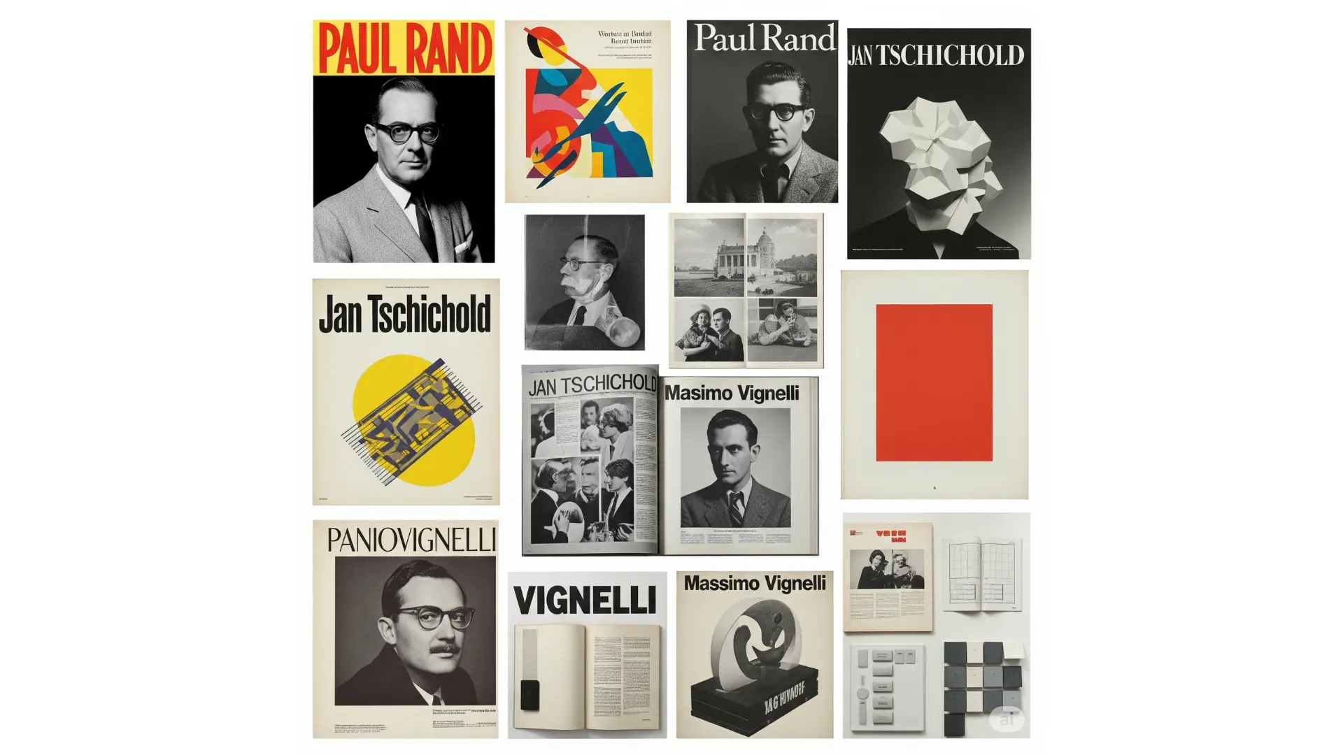
Welcome back to the TiP (Text in Process) blog! Today, we’re taking a journey through the history of editorial design, celebrating the visionaries who laid the groundwork for the visually compelling publications we see today. These pioneers, with their groundbreaking ideas and meticulous execution, transformed the way we experience the printed word. Join us as we explore the lives and legacies of three giants: Paul Rand, Jan Tschichold, and Massimo Vignelli, and discover how their philosophies continue to resonate in contemporary design practices.
Paul Rand: The Power of Visual Identity in Print
Paul Rand (1914-1996) was a towering figure who blurred the lines between graphic design, advertising, and corporate identity. While best known for his iconic logo designs for IBM, UPS, and Westinghouse, Rand’s influence on editorial design is equally significant. He brought a modernist sensibility to the printed page, emphasizing clarity, simplicity, and the powerful interplay of text and image.
Rand believed in the “unmistakable integration of word and image,” a principle evident in his dynamic book jacket designs for publishers like Knopf. His approach was characterized by bold typography, often employing geometric sans-serif fonts, and the strategic use of negative space. He understood that a well-designed cover could not only attract a reader but also visually communicate the essence of the book within.
His philosophy extended beyond aesthetics. Rand was a staunch advocate for the designer as a problem-solver, emphasizing the importance of understanding the content and the target audience. He believed that design should be functional and intellectually engaging. His rigorous approach and unwavering commitment to visual excellence set a new standard for editorial design, demonstrating the power of a strong visual identity in conveying information and capturing attention.
Jan Tschichold: The New Typography and the Power of the Grid
Jan Tschichold (1902-1974) was a pivotal figure in the development of modern typography and editorial design. Initially a proponent of “The New Typography” movement, which embraced asymmetrical layouts, sans-serif typefaces, and the functional use of white space, Tschichold later refined his approach, becoming a master of classical typography and the grid system.
His early work, exemplified in his book Die neue Typographie (The New Typography), advocated for a radical departure from traditional centered layouts and the exclusive use of blackletter fonts. He championed the clarity and efficiency of sans-serif typefaces like Futura and advocated for a more dynamic and hierarchical arrangement of typographic elements.
Later in his career, Tschichold’s work evolved towards a more structured and classical approach. His redesigns for Penguin Books in the 1940s are considered a landmark achievement in editorial design. He established a set of clear and consistent design principles, based on harmonious proportions and the rigorous application of a grid system. This framework provided a flexible yet structured approach to page layout, ensuring legibility and visual coherence across a wide range of publications. Tschichold’s emphasis on the underlying structure of the page and his mastery of typography continue to influence how we organize and present information in editorial contexts.
Massimo Vignelli: Clarity and Timelessness in Editorial Systems
Massimo Vignelli (1931-2014) was a staunch proponent of modernist principles, believing that good design should be universally understood and aesthetically timeless. His work across various disciplines, from corporate identity to product design, was characterized by a rigorous adherence to grid systems, the strategic use of a limited palette of classic sans-serif typefaces (most notably Helvetica), and a profound appreciation for negative space.
In editorial design, Vignelli’s philosophy translated into clean, elegant, and highly functional layouts. He believed that the grid was the fundamental structure that provided order and clarity to the page. His designs for publications like Heller catalogs and The Official Directory of the City of New York exemplify his commitment to simplicity and legibility. He prioritized the content, using design as a tool to enhance its understanding rather than to overshadow it.
Vignelli famously stated, “If you can design one thing well, you can design everything.” This holistic approach and his unwavering dedication to clarity and timelessness have had a lasting impact on editorial design. His emphasis on strong underlying structures and the power of minimalist typography continues to inspire designers striving for elegance and efficiency in their work.
The Enduring Legacy
The contributions of Paul Rand, Jan Tschichold, and Massimo Vignelli have fundamentally shaped the landscape of editorial design. Rand taught us the power of visual identity and the seamless integration of word and image. Tschichold championed the importance of typographic hierarchy and the structural integrity of the grid. Vignelli demonstrated the enduring elegance of minimalist design and the pursuit of timeless clarity.
Their philosophies and iconic works continue to serve as a touchstone for contemporary editorial designers. From the application of grid systems to the thoughtful selection of typography and the strategic use of white space, the principles they espoused remain essential for creating effective and visually compelling publications in the digital age and beyond. As we navigate the ever-evolving world of publishing, understanding and appreciating the foundational contributions of these design luminaries provide invaluable insights and inspiration for shaping the future of editorial design.
Stay tuned to TiP’s blog for more insights into the fascinating world of desktop publishing!

