The Psychology of Color in Editorial Design
The power of visual communication in editorial design extends far beyond typography and layout. Color, a fundamental element of the visual spectrum, plays a crucial yet often subconscious role in how readers interact with and interpret content. At TiP, we understand that a well-considered color palette is not merely aesthetic; it’s a strategic tool that can significantly influence engagement, comprehension, and the overall perception of a publication. This installment of our “Expanding on Design Principles & Practices” series delves into the psychology of color and its practical application in editorial design.
The Foundational Principles of Color Psychology
Color psychology, at its core, examines how different colors affect human emotions and behaviors. These associations are often rooted in cultural conventions, biological responses, and learned experiences. While individual interpretations can vary, certain color associations tend to be broadly consistent. Understanding these foundational principles is paramount for editorial designers aiming to create impactful and resonant publications.
Evoking Emotions Through Color Palettes
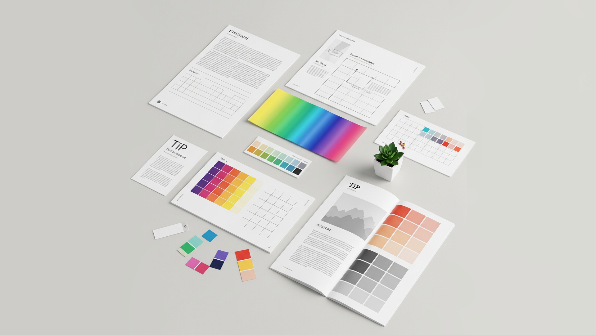
The strategic selection of a color palette is critical in setting the mood and tone of a publication. Whether it’s a corporate annual report, a literary magazine, or a scientific journal, the colors employed contribute significantly to the reader’s overall experience.
- Warm Colors (Reds, Oranges, Yellows): These hues are often associated with energy, excitement, passion, and warmth. In editorial design, they can be used to draw attention to key elements, create a sense of urgency, or evoke feelings of enthusiasm. However, overuse can be overwhelming, so a balanced approach is crucial. For instance, a vibrant red might be used sparingly for call-to-actions in a marketing brochure, while a softer peach tone could create a welcoming feel in a lifestyle magazine.
- Cool Colors (Blues, Greens, Purples): Cool colors tend to evoke feelings of calmness, serenity, trust, and stability. Blue, in particular, is often associated with professionalism and reliability, making it a popular choice for corporate publications. Green often suggests nature, health, and growth, while purple can convey luxury, creativity, or mystery. A magazine focused on mindfulness might utilize a palette of soft blues and greens to promote a sense of tranquility.
- Neutral Colors (Whites, Blacks, Grays, Browns, Beiges): Neutral colors provide a backdrop that allows other colors to stand out. They can convey sophistication, simplicity, and balance. White space, often considered a neutral element, is crucial for readability and visual breathing room. Black can add a sense of elegance and authority, while grays can offer a more subdued and sophisticated feel. Earthy browns and beiges can evoke a sense of warmth and naturalism.
Influencing Reader Perception Through Color
Beyond emotional responses, color palettes can significantly influence how readers perceive the content itself. The judicious use of color can:
- Enhance Hierarchy and Navigation: Strategic use of color can guide the reader’s eye, highlighting headings, subheadings, and important information. Contrasting colors can delineate different sections and improve the overall flow of the publication. For example, a vibrant accent color used consistently for chapter numbers and section titles can aid in navigation.
- Reinforce Branding and Identity: Color is a fundamental aspect of brand identity. Maintaining consistency with brand colors in editorial design strengthens recognition and creates a cohesive visual experience. A company’s logo and brand guidelines often dictate the primary and secondary color palettes used in their publications.
- Convey Subject Matter: The choice of color can subtly communicate the subject matter of the publication. For instance, earthy tones might be appropriate for an environmental magazine, while bold, contrasting colors could suit a contemporary art publication. A financial report might employ a palette of blues and grays to project trust and professionalism.
- Improve Readability and Accessibility: Color contrast between text and background is crucial for readability. Ensuring sufficient contrast not only improves the reading experience for everyone but is also essential for accessibility standards, particularly for individuals with visual impairments. Tools for checking color contrast ratios are indispensable in the editorial design workflow.
Practical Considerations for Editorial Designers
Integrating color psychology effectively into editorial design requires a thoughtful and informed approach. Here are some practical considerations for designers:
- Understand the Target Audience: Consider the demographics, cultural background, and expectations of the intended readership. Color associations can vary across cultures, so research is essential for publications with a global reach.
- Define the Publication’s Purpose and Message: The color palette should align with the overall goals and intended message of the publication. Is it meant to inform, persuade, entertain, or inspire?
- Establish a Hierarchy of Colors: Determine primary, secondary, and accent colors. Primary colors will likely dominate the design, while secondary colors provide support and contrast. Accent colors should be used sparingly to draw attention to specific elements.
- Test and Iterate: Whenever possible, test different color palettes with representative members of the target audience to gauge their reactions and perceptions. Be prepared to iterate on your color choices based on feedback.
- Utilize Color Palette Tools: Numerous online tools and software features can assist in creating harmonious and accessible color palettes. These tools often provide information on color relationships, contrast ratios, and accessibility guidelines.
Conclusion
The psychology of color is a powerful tool in the editorial designer’s arsenal. By understanding how different colors evoke emotions and influence perception, we at TiP (Text in Process) can craft visually compelling and strategically effective publications. A well-considered color palette is not just an aesthetic choice; it’s an integral part of the communication process, enhancing engagement, reinforcing brand identity, and ultimately shaping the reader’s experience. As you embark on your next editorial design project, remember the profound impact that color can have and leverage its psychological power to create truly resonant and impactful publications.
