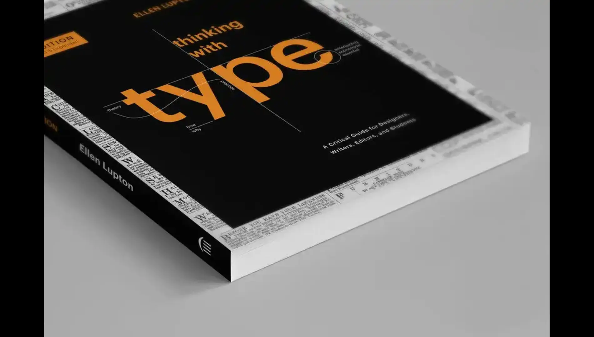
Typography Matters: Lessons from Ellen Lupton’s “Thinking with Type”
(Part 1: Letters & Text)
Typography isn’t just about making text look good—it’s about shaping meaning. That’s the core message of Ellen Lupton’s influential book, Thinking with Type, a must-read for anyone who works with words visually: graphic designers, web developers, editors, students, and typophiles alike.
In this two-part series, we’ll unpack Lupton’s ideas section by section and explore how typography functions not just as form, but as content and communication. Part 1 focuses on the first two sections of the book: Letter and Text.
The Power of the Letter
We tend to think of fonts as aesthetic choices. But Lupton quickly teaches us that each letterform carries history, intention, and emotion. The type you choose will either support your message—or work against it.
She opens with the anatomy of type: terms like x-height, ascenders, descenders, and counters might sound technical, but understanding them reveals how small visual differences dramatically affect legibility and tone.
Consider the difference between a serif and a sans serif. One suggests tradition and bookishness (Times New Roman), while the other conveys modernity and minimalism (Helvetica). But even within categories, there’s nuance. A humanist sans serif like Gill Sans feels friendly and open. A geometric sans like Futura feels cool and mechanical.
Lupton’s challenge to readers: Stop picking fonts because they “look cool.” Start selecting them based on their communicative role.
The Text as Texture and Structure
Once letters become words, we move into the territory of Text—the rhythm, spacing, and structure of written content. This is where many designers either shine or fall flat.
Lupton introduces the big three:
- Kerning: adjusting space between specific characters
- Tracking: adjusting space uniformly across a word or line
- Leading: the vertical space between lines
If these seem small, they’re not. Improper leading can make a beautifully written article unreadable. Tight tracking might feel stylish but can suffocate the words.
She also examines alignment: flush left (the standard for readability), centered (use with caution), and justified (often abused in amateur layouts). These decisions don’t just affect how text looks—they control how the reader experiences it.
Hierarchy is another core principle. Headlines, subheads, captions—all these levels need to stand out clearly, not fight for attention. Lupton advises using contrast—size, weight, color, or spacing—to help readers navigate information without confusion.
Application: What You Can Do Today
- Review your last project. Did your type choices align with the message?
- Practice spacing: Print a paragraph, adjust the leading and tracking, and observe how it feels.
- Try limiting yourself to two fonts—use variations in weight and size instead of adding more styles.
Final Thoughts
Typography is a craft of precision. But it’s also a deeply expressive medium—what Lupton calls “the visual form of language.” Understanding it is not about rules for rules’ sake—it’s about clarity, credibility, and connection.
In Part 2, we’ll explore how Lupton uses grids and layouts to bring structure to chaos—and how to break those rules like a pro.
Stay tuned!
