Thinking with Structure: Grids, Layouts & Expression in Typography
(Part 2: Grid & Beyond)
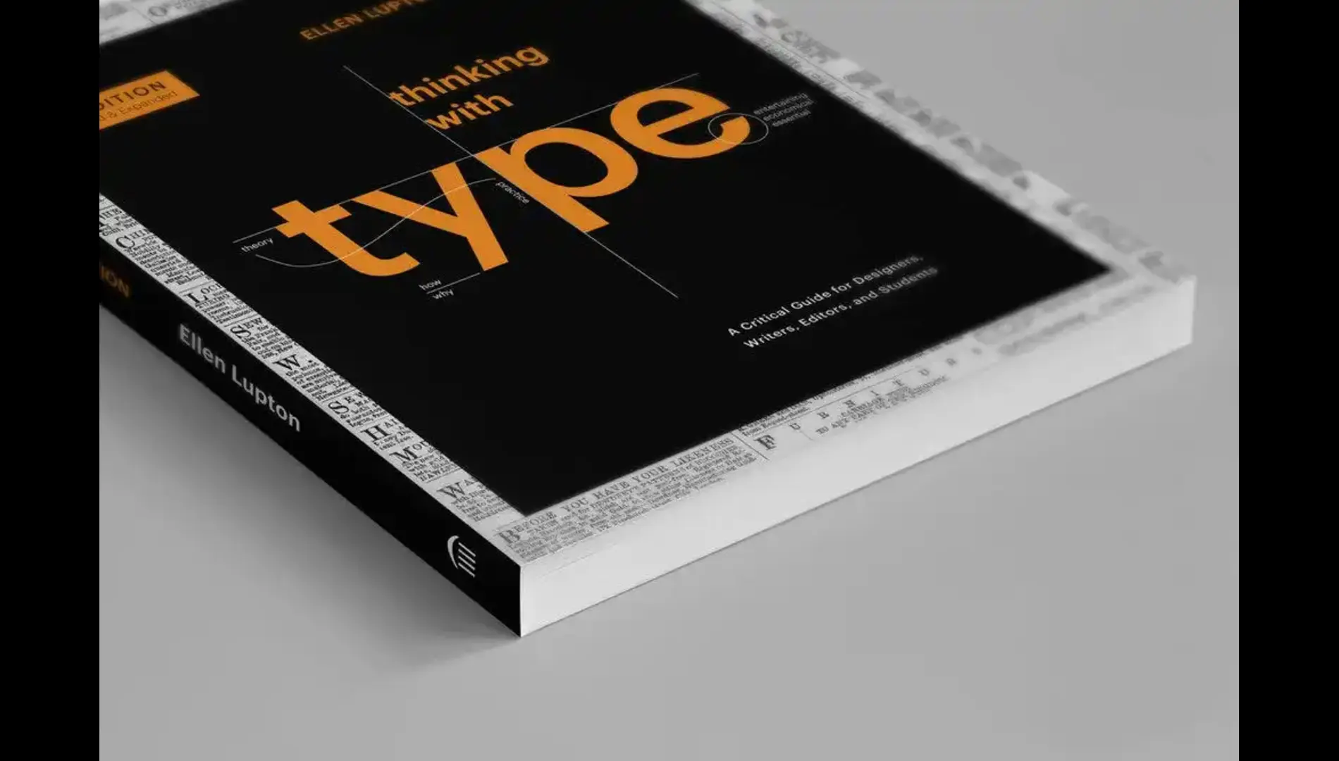
In Part 1 of this series on Ellen Lupton’s Thinking with Type, we explored how typefaces and spacing shape meaning and readability. Now, we turn to the final section of the book: the Grid.
Grids might sound rigid, mathematical, even boring. But as Lupton shows us, a well-designed grid is the invisible architecture of any good composition. And just like a good blueprint, it gives designers the power to organize complexity into clarity.
The Grid: Structure and Freedom
A grid is a system of vertical and horizontal lines used to align and structure content. In Lupton’s words, it’s not a prison—it’s a platform. The purpose is not to restrict creativity but to enhance coherence and flow.
Grids can be simple (like a two-column layout) or complex (modular systems for magazines or websites). They give consistency to recurring elements: headers, images, text blocks, margins. When used well, they make the content feel clean, organized, and professional.
Lupton also highlights how the deliberate breaking of the grid can create visual interest—when done with purpose. If your design feels too symmetrical or flat, experimenting with asymmetry or tension can inject life into your composition.
White Space Is Not Empty Space
One of Lupton’s most powerful lessons is the value of white space. Space around text isn’t waste—it’s breathing room. It helps the eye move. It gives importance to what’s on the page.
Designers often feel pressured to fill space. Lupton argues for the opposite: use restraint. Let the content shine.
The Designer as an Author
Beyond layout, Thinking with Type explores a profound idea: the designer as a writer, editor, and reader. Typography is not separate from content—it is content. That means designers make rhetorical choices, not just visual ones.
When you change a headline’s font, you’re not just changing the style—you might be changing the tone, urgency, or credibility of the message.
This holistic approach resonates in professional design and academic settings alike. Whether you’re making a poster, a web app, or an editorial spread, typography becomes your voice.
Takeaways You Can Use Today
- Use grids to create structured, elegant designs.
- Don’t fear white space—embrace it.
- Treat text as a voice. What tone does your typography speak in?
- Practice breaking the grid—but always with intention.
A Book for Thinking Designers
Ellen Lupton’s Thinking with Type remains a timeless resource because it blends history, theory, and practical design guidance in a readable, engaging way. It doesn’t just tell you how to design—it challenges you to think about why your choices matter.
Whether you’re a student starting out or a seasoned pro, revisiting the basics with fresh eyes can elevate your work—and help you design with meaning.