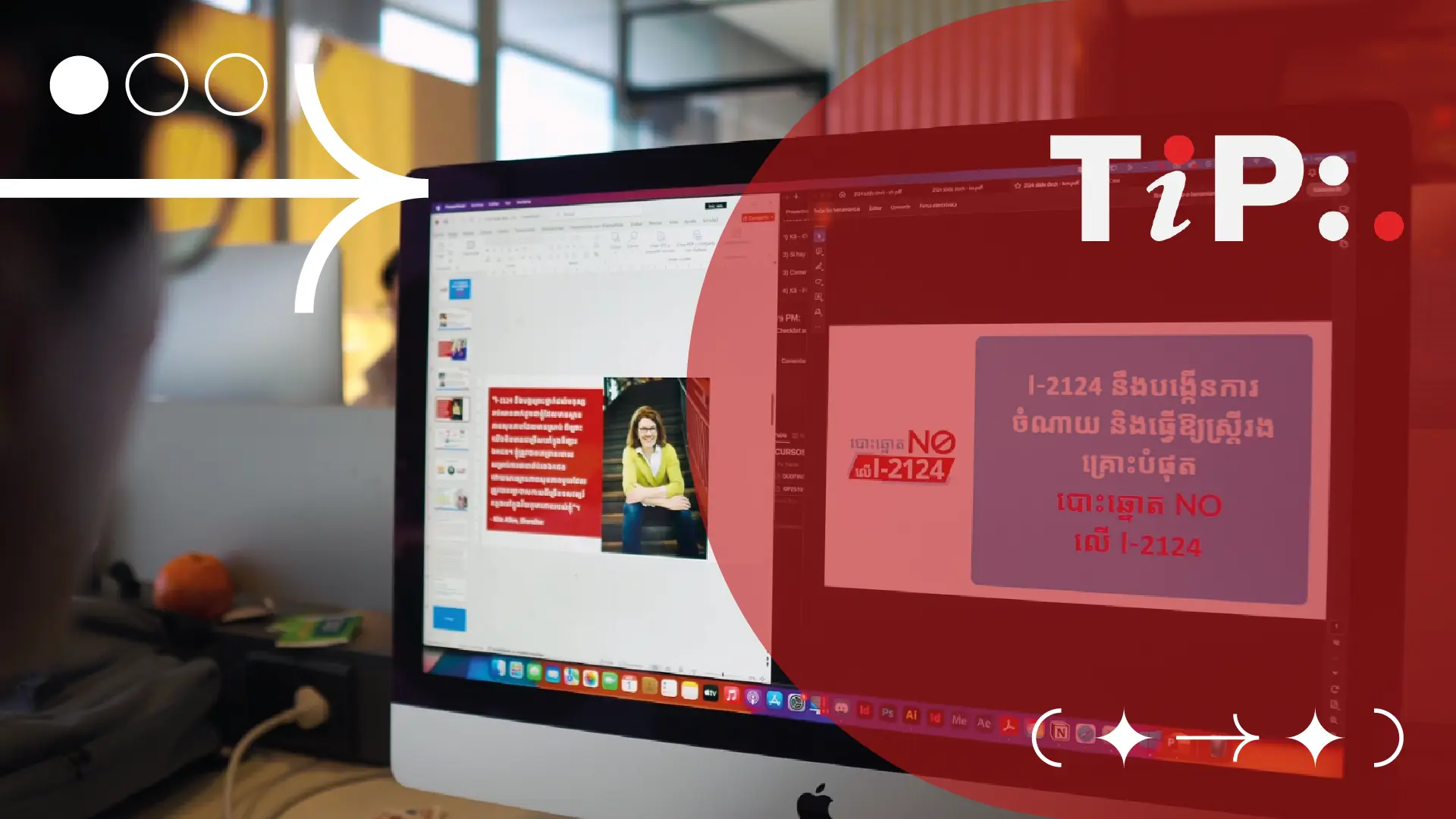
The Power of Typography in DTP: A Visual Language
Typography, the art and technique of arranging type, is a fundamental aspect of desktop publishing (DTP). A well-chosen typeface can significantly impact the readability, aesthetic appeal, and overall effectiveness of a document.
The Importance of Typography in DTP
- Readability: A clear and legible typeface enhances readability and reduces eye strain.
- Aesthetics: Typography can create a specific mood or atmosphere, from formal and serious to playful and fun.
- Brand Identity: Consistent use of fonts can strengthen brand recognition and reinforce brand messaging.
- Accessibility: Choosing accessible fonts ensures that documents can be read by people with visual impairments.
Choosing Fonts for Multilingual Texts
When designing multilingual documents, font selection becomes even more critical. Here are some key considerations:
- Character Support: Ensure the font supports the character sets of all languages used in the document.
- Readability: Prioritize clear and legible fonts that are easy to read in different languages.
- Cultural Sensitivity: Consider cultural preferences and avoid fonts that may have negative connotations in certain cultures.
- Consistency: Maintain consistent font styles and sizes throughout the document.
The Pitfalls of Incompatible Fonts
Using a font that is not compatible with multilingual systems can lead to several issues:
- Character Encoding Errors: Incorrect display of characters, especially special characters or symbols.
- Layout Disruptions: Misaligned text, incorrect line breaks, and poor kerning.
- Readability Issues: Difficulty in reading text due to poor font rendering or missing glyphs.
- Professional Image Damage: A poorly formatted document can reflect negatively on the sender or organization.
Best Fonts for Multilingual Systems
To avoid these pitfalls, consider using fonts that are specifically designed for multilingual support:
- Universal Fonts: Fonts like Arial, Times New Roman, and Verdana are widely supported and can be used across various languages.
- OpenType Fonts: These fonts support a wide range of character sets and can adapt to different languages and scripts.
- Language-Specific Fonts: For specific languages or regions, consider using fonts that are optimized for those languages, such as Adobe Arabic or Microsoft YaHei.
Additional Tips for Multilingual Typography
- Test Thoroughly: Before finalizing the design, test the document on different devices and operating systems to ensure proper rendering.
- Consult with Language Experts: Seek advice from language experts to understand cultural nuances and font preferences.
- Use a Reliable Font Manager: A font manager can help organize and manage fonts, ensuring that the correct fonts are used in your projects.
- Consider Accessibility: Choose fonts that are accessible to people with visual impairments, such as dyslexia.

By carefully selecting and using fonts, you can create visually appealing and effective multilingual documents that leave a lasting impression.
