The Power of Typography in Editorial Design: From Movable Type to Digital Fonts
Typography is the silent hero of editorial design. It shapes the way we perceive information, influences how we engage with content, and guides our reading experience. From the earliest days of movable type to today’s sophisticated digital fonts, typography has evolved alongside technology, cultural shifts, and artistic movements, continually redefining editorial design.
A Brief History of Typography in Editorial Design
The journey of typography begins with Johannes Gutenberg’s invention of the movable type printing press in the mid-15th century. This groundbreaking innovation revolutionized communication, making printed materials more accessible and affordable. Early typefaces, inspired by handwritten manuscripts, were ornate and dense, emphasizing legibility over aesthetics.
As printing technology spread, typographic design evolved. The Renaissance period introduced more refined serif fonts, such as Garamond and Bembo, which balanced elegance and readability. The Industrial Revolution brought new challenges with mass production, leading to the creation of bold display typefaces for advertising and headlines.
The 20th century marked a turning point as designers began to see typography not just as a tool for communication but as an art form. This shift laid the groundwork for modern editorial design, where typography became central to visual storytelling and brand identity.
The Impact of Modernist Typography on Editorial Design
One of the most influential movements in typographic history was Modernism, emerging in the early 20th century. Influenced by the Bauhaus school and figures like Jan Tschichold. Modernist typography embraced simplicity, functionality, and asymmetry. Designers rejected decorative elements in favor of clean lines, geometric forms, and grid systems that brought order and clarity to the page.
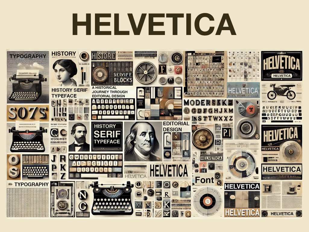
Modernism championed sans-serif typefaces for their simplicity and readability. Helvetica, designed in 1957 by Max Miedinger and Eduard Hoffmann, became an icon of the Modernist ethos, embodying neutrality and universality. Its clean, no-nonsense style made it a favorite for editorial design, from newspapers to corporate reports.
The Modernist approach also introduced the idea of hierarchy in typography, using size, weight, and spacing to guide the reader’s eye. Headlines were bold and attention-grabbing, subheadings provided context, and body text was clear and consistent. This strategic use of typography revolutionized how information was organized and consumed, laying the foundation for contemporary editorial layouts.
The Swiss Style: Precision and Grid Systems
Building on Modernist principles, the Swiss Style, or International Typographic Style, emerged in Switzerland in the 1950s. Designers like Josef Müller-Brockmann and Emil Ruder championed a grid-based approach, emphasizing structure, precision, and objectivity. The Swiss Style introduced the modular grid system, which brought unparalleled order to editorial layouts, ensuring alignment and consistency across all design elements.
Typography in Swiss Style was typically sans-serif, with Akzidenz-Grotesk and Univers being popular choices. These typefaces were celebrated for their simplicity and neutrality, aligning with the movement’s commitment to functionality over decoration. Swiss designers used whitespace strategically, creating airy, balanced layouts that enhanced readability.
This influence is still evident in contemporary editorial design, from high-end magazines to digital interfaces. Grids and clean typography are essential tools for creating cohesive and aesthetically pleasing layouts, helping designers maintain visual hierarchy and consistency across multiple pages or screens.
Typography in the Digital Age: Flexibility and Innovation
The digital revolution transformed typography once again. With the advent of the internet, designers faced new challenges, including screen resolution, responsive layouts, and web accessibility. Digital typography had to adapt to different devices, from desktops to smartphones, without compromising readability or aesthetics.
The development of web fonts, such as Google Fonts and Adobe Typekit, democratized access to high-quality typography. Designers now have the flexibility to experiment with a vast range of typefaces, weights, and styles, tailoring editorial content to brand identities and user experiences.
Variable fonts, a recent innovation, it allows designers to adjust weight, width, and slant within a single font file. This adaptability enhances responsive design, ensuring typography remains legible and visually appealing across all screen sizes.
Balancing Aesthetics and Functionality
While aesthetics are important, the primary purpose of typography in editorial design is to facilitate communication. Effective typography strikes a balance between beauty and functionality, guiding readers through the content while enhancing the overall visual experience.
Hierarchy is key to achieving this balance. Designers use a combination of font sizes, weights, and styles to create a logical flow of information, ensuring that headlines, subheadings, and body text are easily distinguishable. Color contrast and whitespace further enhance readability, helping readers navigate complex layouts with ease.
Modern editorial designers are also leveraging typography to create emotional impact and brand identity. Bold, expressive fonts can convey personality, while minimalist, neutral typefaces evoke a sense of sophistication and professionalism. By thoughtfully selecting and pairing typefaces, designers can influence how audiences perceive and connect with content.
Enduring Legacy and Future Trends
Typography’s journey from movable type to digital fonts reflects the evolution of communication itself. Historical movements like Modernism and Swiss Style continue to inspire contemporary designers, who adapt these principles to new technologies and cultural contexts.
Looking ahead, the future of typography lies in continued experimentation and innovation. AI-driven typography, augmented reality (AR) interfaces, and immersive experiences are pushing the boundaries of how we interact with text. Yet, the core principles of legibility, hierarchy, and visual harmony remain timeless.
Typography as the Heartbeat of Editorial Design
Typography is more than just arranging letters on a page—it is the heartbeat of editorial design. It shapes narratives, influences emotions, and creates memorable experiences. As technology and design trends continue to evolve, the role of typography will remain crucial, connecting past traditions with future possibilities.
By understanding the historical context and embracing modern innovations, designers can harness the power of typography to create editorial works that are not only visually stunning but also meaningful and impactful.