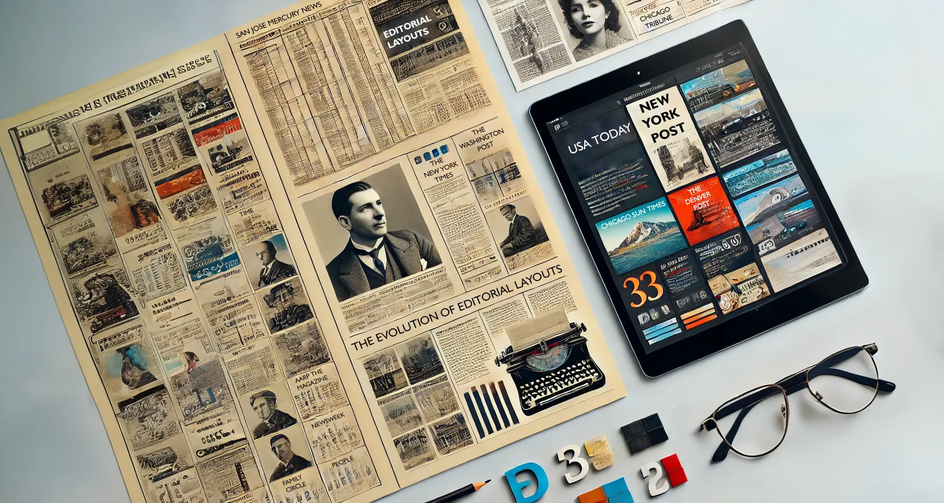
The Evolution of Editorial Layouts: From Rigid Grids to Creative Freedom
Editorial layout hs come a long way from the rigid, grid-based structures of early newspapers to the dynamic, visually engaging designs we see in modern publications. As printing technology, design sensibilities, and reader expectations evolved, so did the way publications structured their pages. This evolution has been shaped by influential figures and groundbreaking publications that pushed the boundaries of layout design, impacting: readability, flow, and overall visual appeal.
The Early Days: The Grid System
In the early days of print media, particularly in the 19th and early 20th centuries, newspaper layouts were dominated by strict grid-based formats. This rigid structure was driven by the limitations of printing technology and the need to accommodate large amounts of text efficiently. Newspapers such as The New York Times and The London Times adhered to this approach, arranging articles in columns with justified text and minimal imagery. Headlines and subheadings provided hierarchy, but the design was primarily functional rather than visually engaging.
The grid-based approach was effective for quickly conveying information but lacked the flexibility to accommodate creativity. However, this structure provided the foundation upon which future editorial layouts were built.
The Rise of Photojournalism and Experimentation
The early-to-mid 20th century saw significant advancements in printing technology, enabling greater use of photography and illustration. Publications such as Life Magazine and National Geographic capitalized on this by incorporating large, impactful images alongside text. This shift marked the beginning of a more visually driven editorial approach, where images played an essential role in storytelling.
During this time, designers began experimenting with asymmetry, larger headlines, and varied column widths to break away from the traditional rigid structure. Life Magazine, in particular, revolutionized editorial design by placing full-page photos with minimal text, prioritizing visual storytelling over dense content. This era laid the groundwork for future innovations in editorial layout.
The Influence of Modernist Design and Typography
The mid-20th century also saw the rise of modernist design principles, heavily influenced by movements like the Bauhaus and Swiss Style. Designers such as Josef Müller-Brockmann championed the use of structured yet flexible grid systems that allowed for clean, organized layouts with a strong sense of hierarchy. Publications like The New Yorker adopted these principles, refining the balance between text and imagery while maintaining a sophisticated aesthetic.
Typography also played a crucial role in evolving editorial layouts. Designers began using bold, striking fonts to draw attention to key elements, making publications more engaging. The interplay between text and imagery became more dynamic, creating a seamless reading experience.
The Age of High-Fashion Editorials
Fashion publications, particularly Vogue, took editorial layouts to a new level in the latter half of the 20th century. Led by legendary editors and art directors such as Diana Vreeland and Alexey Brodovitch, these magazines treated layout design as an art form. Spreads featured dramatic photography, unconventional text placements, and white space used strategically for emphasis.
Broader use of color printing further allowed for expressive layouts that blended text and imagery in captivating ways. The ability to manipulate space, layering, and alignment turned editorial design into an immersive experience rather than just a means of delivering information.
Digital Revolution and Editorial Freedom
The transition to digital media in the late 20th and early 21st centuries further revolutionized editorial layouts. Online publications and digital magazines introduced an entirely new dimension to layout design. Interactive elements, scrolling effects, and multimedia integration allowed for unparalleled flexibility. Websites such as The New York Times’ digital platform and independent online publications experimented with infinite scrolls, parallax effects, and adaptive designs that adjust to different screen sizes.
Responsive design became a necessity, ensuring layouts remained effective across devices from desktops to smartphones. Designers now have the freedom to break conventional print limitations, employing animations, video embeds, and interactive infographics to enhance reader engagement.
The Impact of Layout Choices on Readability and Appeal
Throughout this evolution, one constant remains: layout choices significantly affect how readers engage with content. A well-structured layout improves readability, making information digestible and engaging. Elements such as white space, typography, image placement, and column width influence how the eye moves across the page, guiding the reader’s attention to key points.
Publications that master the balance between text and visuals create an immersive experience, whether in print or digital form. The interplay between structured design principles and creative freedom ensures that editorial layouts will continue to evolve in exciting new directions.
Conclusion
From the rigid grids of early newspapers to the boundary-pushing designs of modern digital media, editorial layouts have undergone a fascinating transformation. Influential publications like The New York Times, Life Magazine, and Vogue have played pivotal roles in shaping this evolution, redefining how content is presented and consumed. As technology advances, editorial design will continue to push creative boundaries, blending art, functionality, and storytelling in ever more innovative ways.