The Birth of Modern Editorial Design: A Look at the Bauhaus Movement
When we flip through the pages of modern magazines or scroll through digital editorials, the clean lines, strategic use of white space, and bold typography might feel natural, even obvious. Yet, these seemingly straightforward design choices are rooted in a revolutionary movement that redefined art, architecture, and graphic design in the early 20th century—the Bauhaus movement.
Background
The Staatliches Bauhaus (German: [ˈʃtaːtlɪçəs ˈbaʊˌhaʊs]), commonly known as the Bauhaus (German for ‘building house’), was a German art school operational from 1919 to 1933 that combined crafts and the fine arts.
The Bauhaus was founded by architect Walter Gropius in Weimar. It was grounded in the idea of creating a Gesamtkunstwerk (“comprehensive artwork”), in which all the arts would eventually be brought together. The Bauhaus style later became one of the most influential currents in modern design, modernist architecture, and architectural education. The Bauhaus movement had a profound influence on subsequent developments in art, architecture, graphic design, interior design, industrial design, and typography. Staff at the Bauhaus included prominent artists such as Paul Klee, Wassily Kandinsky, Gunta Stölzl, and László Moholy-Nagy at various points. (https://en.wikipedia.org/wiki/Bauhaus)
A New Vision for Design: The Bauhaus Philosophy
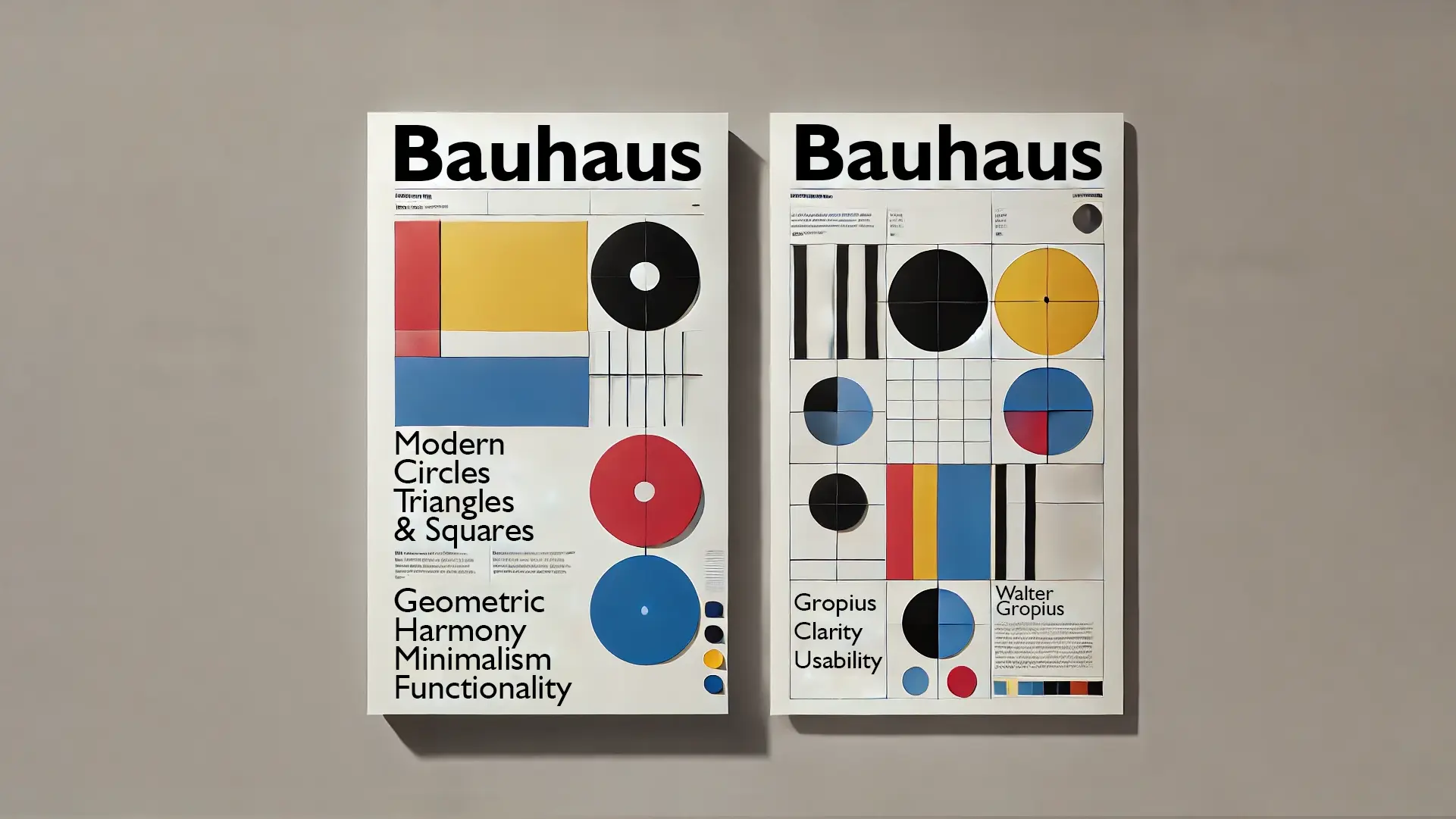
At its core, the Bauhaus movement emphasized functionality, minimalism, and geometric precision. Gropius envisioned a school that would bridge the gap between art and industry, promoting a unity of form and function. This approach was radical for its time, rejecting the ornate and decorative styles of the past in favor of simplicity and practicality.
The Bauhaus designers believed that design should serve society, focusing on clarity and usability. This philosophy naturally extended to printed materials, where clear communication is key. By emphasizing a minimalistic aesthetic with a focus on grids, sans-serif typography, and dynamic compositions, Bauhaus pioneers laid the foundation for the clean and organized layouts we associate with modern editorial design.
Influence on Editorial Design: Breaking the Mold
Before the Bauhaus movement, editorial design was largely characterized by dense text blocks, elaborate fonts, and heavily ornamented borders. The layouts were often chaotic, with little regard for readability or hierarchy. The Bauhaus approach revolutionized this, introducing the concept of the grid system—an invisible structure that organizes content, ensuring balance and coherence on the page.
By using grids, designers could align text, images, and other elements more systematically, creating harmonious layouts that guide the reader’s eye. This method of structuring information not only enhanced readability but also made the design more aesthetically pleasing. Today, grid systems are a cornerstone of editorial design, from print magazines to digital platforms.
Geometry, Typography, and Minimalism: Hallmarks of Bauhaus Design
One of the most striking aspects of Bauhaus-inspired editorial work is its geometric precision. Bauhaus artists, such as László Moholy-Nagy and Herbert Bayer, experimented with basic shapes—circles, triangles, and squares—to create dynamic compositions that conveyed movement and depth. This geometric approach broke away from traditional design constraints, allowing for more playful and experimental layouts.
Typography was another revolutionary element in Bauhaus design. The movement championed sans-serif typefaces, which were simpler and easier to read than the ornate serif fonts of the time. Herbert Bayer, a Bauhaus master, designed the Universal typeface, characterized by its clean, functional lines and lack of capital letters. This emphasis on simplicity and legibility became a defining feature of modern editorial typography, influencing countless publications.
Historical Examples: Bauhaus in Print
Several iconic publications from the 20th century drew inspiration from Bauhaus principles. Die Neue Typographie by Jan Tschichold, although not directly affiliated with the Bauhaus, was heavily influenced by its design philosophy. Tschichold’s work promoted asymmetrical layouts, sans-serif fonts, and the strategic use of white space—ideas rooted in Bauhaus teachings.
Similarly, the Swiss Style of graphic design, popularized by designers like Josef Müller-Brockmann, continued to build on Bauhaus principles, emphasizing grid-based layouts, bold typography, and a minimalist aesthetic. Publications like Neue Grafik showcased these ideas, influencing modern magazine design and corporate branding worldwide.
Enduring Legacy: Bauhaus in Contemporary Editorial Design
The influence of Bauhaus on editorial design is as relevant today as it was a century ago. Modern magazines such as Vogue, The New Yorker, and WIRED use grid systems, bold typography, and minimalist layouts that can be traced back to Bauhaus principles. In digital design, websites and online publications continue to employ geometric compositions and functional typography, ensuring clarity and ease of navigation.
Bauhaus’s impact is not just stylistic but conceptual. Its emphasis on functionalism and clarity of communication resonates with contemporary designers striving for accessibility and user-centric design. As we continue to evolve in a digital age, the Bauhaus philosophy serves as a timeless reminder that great design is not just about aesthetics but about purpose and utility.
Conclusion: The Bauhaus Spirit Lives On
The Bauhaus movement’s radical vision reshaped not only art and architecture but also the way we approach editorial design. By championing functionality, minimalism, and geometric harmony, Bauhaus pioneers laid the groundwork for a modern visual language that continues to inspire designers today. As we look at the clean, organized layouts of contemporary editorials, we are, in essence, witnessing the legacy of Bauhaus—a testament to its enduring influence on the art of communication.