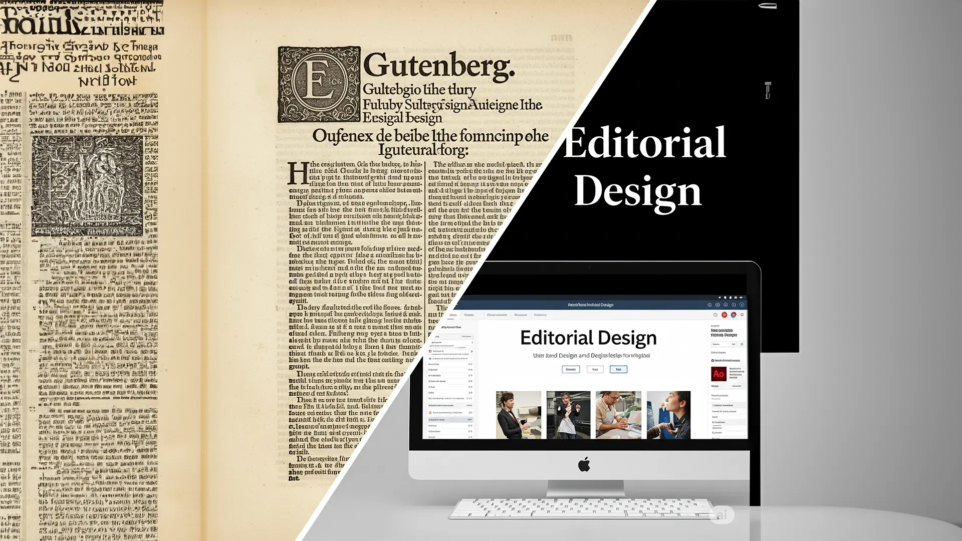
Accesible Editoria Design – From Gutenberg to WCAG
Welcome back to the TiP (Text in Process) blog! As a desktop publishing agency, we’re deeply invested in the art and science of presenting information effectively. Today, we’re taking a journey through the fascinating history of accessible editorial design, exploring how our understanding of inclusivity has shaped the way we create and consume written content. From the earliest printed materials to the sophisticated digital standards of today, the evolution of accessibility in editorial design is a testament to our growing awareness of diverse user needs.
Early Days: The Dawn of Print and Implicit Accessibility
While the term “accessible design” is relatively modern, the seeds of inclusivity were sown with the advent of the printing press in the 15th century. Gutenberg’s innovation, while revolutionary in its dissemination of knowledge, inadvertently introduced certain visual consistencies. Standardized typefaces, relatively consistent line spacing, and the inherent contrast between black ink and white paper offered a baseline of readability for many.
However, accessibility at this stage was largely implicit. Considerations for individuals with visual impairments, cognitive differences, or motor disabilities were not explicitly integrated into the design process. The focus was primarily on legibility for the average reader, with little understanding of the diverse spectrum of human perception.
The Rise of Awareness: Seeds of Change in the Industrial Era
The Industrial Revolution brought with it increased literacy rates and, consequently, a wider readership. This period also saw the emergence of advocacy for individuals with disabilities. While not directly focused on editorial design, these movements laid the groundwork for future considerations of inclusivity in all aspects of life, including access to information.
Technological advancements in printing also allowed for greater experimentation with typography and layout. However, this experimentation didn’t always prioritize accessibility. Ornate typefaces, densely packed text, and low contrast remained prevalent, potentially creating barriers for some readers.
The Digital Revolution: A Paradigm Shift in Accessibility
The advent of the digital age marked a significant turning point for accessible editorial design. The shift from static print to dynamic digital formats opened up a plethora of possibilities for customization and adaptation. Simultaneously, the internet’s potential to reach a global and diverse audience brought the importance of inclusivity into sharp focus.
This era witnessed the development of crucial accessibility guidelines and legislation. The Web Content Accessibility Guidelines (WCAG), developed by the World Wide Web Consortium (W3C), emerged as a globally recognized standard for making web content more accessible to people with disabilities. These guidelines address a wide range of considerations relevant to editorial design in the digital realm, including:
- Perceivable Information: Ensuring users can perceive the information being presented. This includes providing text alternatives for non-text content, offering captions and other alternatives for audio and video, and ensuring content can be presented in different ways (e.g., simpler layout) without losing information or structure.
- Operable Interface: Ensuring users can operate the interface. This involves making all functionality available from a keyboard, providing users enough time to read and use content, and designing content in a way that does not cause seizures.
- Understandable Information: Ensuring users can understand the information. This includes making text content readable and understandable, making the appearance and operation of web pages predictable, and helping users avoid and correct mistakes.
- Robust Content: Ensuring content can be interpreted reliably by a wide range of user agents, including assistive technologies.
Focusing on Key Elements of Accessible Editorial Design
In today’s landscape, accessible editorial design is no longer an afterthought but an integral part of the design process. Several key elements contribute to creating inclusive and effective communication:
1. Typographic Accessibility:
- Typeface Selection: Choosing clear and legible typefaces with well-defined letterforms and ample x-height is crucial. Sans-serif fonts are often preferred for body text due to their simplicity, but well-designed serif fonts can also be accessible. Avoiding overly decorative or condensed typefaces is essential.
- Font Size and Line Height: Providing sufficient font size and generous line height (leading) improves readability and reduces eye strain, particularly for individuals with low vision or dyslexia. Allowing users to adjust text size is a key accessibility feature in digital environments.
- Kerning and Tracking: Paying attention to the spacing between letters (kerning) and words (tracking) ensures comfortable reading flow and prevents letters from appearing too crowded or too far apart.
2. Color Contrast:
- Foreground and Background Contrast: Ensuring sufficient contrast between text color and background color is paramount for users with low vision. WCAG 2.1 Level AA requires a contrast ratio of at least 4.5:1 for normal text and 3:1 for large text. Level AAA recommends even higher contrast ratios.
- Avoiding Color as the Sole Conveyor of Information: Relying solely on color to communicate meaning can exclude individuals who are colorblind. Using redundant cues, such as text labels or patterns, ensures that information is accessible to everyone.
3. Visual Cues and Information Architecture:
- Clear Hierarchy and Structure: Using headings (H1-H6), subheadings, bullet points, and numbered lists creates a clear visual hierarchy and makes content easier to scan and understand. This is particularly beneficial for individuals with cognitive disabilities or those using screen readers.
- Meaningful Use of White Space: Adequate white space (negative space) around text blocks and visual elements improves readability and reduces visual clutter, making the content less overwhelming.
- Descriptive Link Text: Using clear and concise link text that accurately describes the destination of the link is crucial for screen reader users and provides context for all users. Avoid generic phrases like “click here.”
- Alternative Text for Images: Providing descriptive alternative text (alt text) for all images ensures that screen reader users can understand the content and purpose of visual elements.
The Ongoing Journey Towards Inclusivity
The evolution of accessible editorial design is an ongoing process. As technology advances and our understanding of diverse user needs deepens, so too will our approaches to creating inclusive and effective communication. By embracing the principles of typographic accessibility, color contrast, and thoughtful visual cues, we, as desktop publishing professionals, can play a vital role in ensuring that information is accessible to everyone, regardless of their abilities.
At TiP (Text in Process), we are committed to staying at the forefront of accessible design practices. We believe that good design is inherently inclusive design. If you have any questions about how we can help you create accessible and engaging content, don’t hesitate to reach out!